
Committed to achieving optimal health outcomes and health equity for our community.
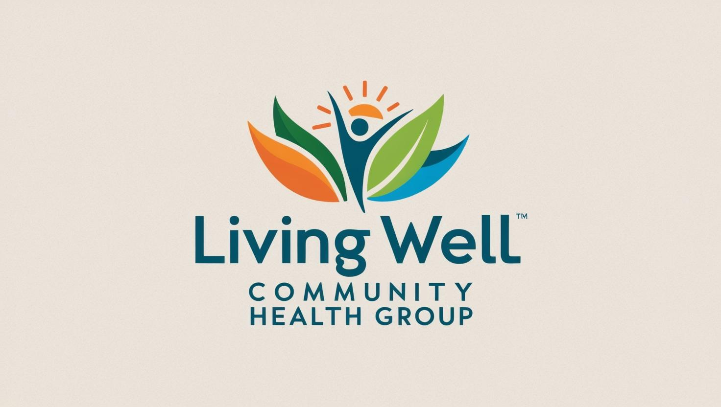
Learn MoreLiving Well Community Health Group's brand is intentionally designed to reflect its holistic, equity-driven approach to health by visually embedding the five key domains of the social determinants of health into its identity. Each color in the brand represents a specific domain, reinforcing the organization's mission to address the root causes of health disparities and promote well-being for all.
Blue represents knowledge, clarity, and opportunity. It reflects our belief that access to quality education from childhood through adulthood is foundational to long-term health. Through health literacy programs, school-based partnerships, and community education initiatives, we aim to empower individuals and communities with the tools to thrive.
Red evokes urgency, vitality, and compassion, hallmarks of our healthcare mission. This color embodies our work to ensure equitable access to high-quality, affordable, and culturally competent healthcare services. We advocate for systems that treat the whole person, reduce disparities, and uphold the dignity of every individual.
Aqua Blue reflects freshness, safety and harmony with the environment. It symbolizes our efforts to promote safe housing, access to health food, green spaces, clean air, and walkable communities. We believe that where people live, work, and play should support, not hinder their health.
Gold stands for connection, equity, and empowerment. It represents our deep investment in building strong social networks, addressing systemic racism, and fostering inclusive, resilient communities. Through trusted relationships and collaborative engagement, we elevate the voices of those most impacted by health inequities.
Green signifies growth, financial security, and opportunity. It reflects our commitment to advancing employment access, job training, financial empowerment, and policies that address poverty as a root cause of poor health. We support pathways to economic mobility that enable individuals and families to build healthier futures.
Together, these five colors don't just inform our design - they reflect the layered challenges and collective strength behind Living Well's purpose: To champion community health through a lens of equity, access, and empowerment, addressing the full spectrum of conditions that shape individual and collective well-being.
To eliminate health disparities affecting Black, African Americans, and People of African Descent by providing advocacy, education, programs and services that lead to optimal health outcomes.

A world where Black individuals, African Americans, and People of African Descent achieve equitable health outcomes, free from systemic barriers and health disparities.

Comprehensive health care services to meet your needs.
Workshops, classes, and support groups tailored to you.
Building a healthier future together through outreach and education.

At Living Well Community Health Group, we believe healing is not just an individual journey — it's a shared experience rooted in culture, connection, and care. Our spaces foster environments where vulnerability is met with strength and community transforms isolation into resilience. We feel that our collective well-being depends on unity.
Reach out to explore services, build partnerships, or get support.